
Freehand Hatched Style in Adobe Illustrator, Part Four: Scatter Brushes
/▷ Part One: Why Use Illustrator?
▷ Part Two: Basics of Graphic Styles
▷ Part Three: Creating a Freehand Profile
▶ Part Four: Scatter Brushes
We’re going to make some Scatter brushes. Scatter is a brush style that takes a shape and “stamps” copies of it along a path. We can create variations of that shape by rotating it, scaling it, and shifting it in and out relative to the path.

Simple Scatter Brush
Scatter doesn’t distort the shape to fit the path in the way that a Pattern or Artistic brush does, which can be either a helpful or problematic feature of the style. We’ll create a couple of map line styles that take advantage of the particular features of the Scatter brush.
Scatter Brushes
Pros
Easy to introduce variation and randomness.
The brush can be readily tweaked for density and scale.
Cons
Doesn’t turn sharp corners well under some circumstances..
Can introduce a lot of geometry into a drawing.
Here’s what we’ll make — two styles of brush, stippled and hatched:

Scatter Brushes: Stipple (left) and Hatch (right)
These brushes emulate pen-and-ink shading from old-school RPG maps. For modern versions of similar maps, check out Dyson’s Dodecahedron and Niklas Wistedt
We’ll start with the stipple.
Setup
In order to make following along easier, you may wish to apply these Adobe Illustrator settings.
Don’t turn on Snap to Grid, as we will be working at a smaller scale than the grid.
Create the Stipple Brush

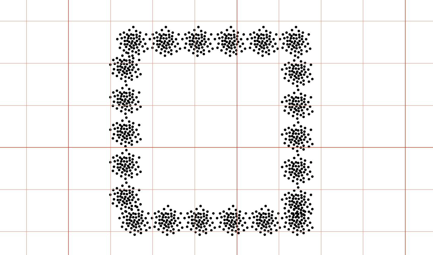
The process of creating the stipple brush. 1/4” Grid shows scale

Transform Each dialog
Make an ellipse 1 pt by 1 pt. You can do this by selecting the Ellipse shape tool, clicking in the drawing, and entering the values in the dialog. This ellipse will be one of our stipple dots. It should have a black fill and no stroke.
Option-drag several copies of the circle.
Create a rough circle filled with dots. It should be densest at its center, more sparse at its circumference. Drag the dots around until you have an approximation of the arrangement shown above.
Randomize the dots with Transform Each. We’ll make the dots look more natural by squishing and stretching them a bit. This will emulate the imperfections of hand drawn-dots. Select all the dots and choose Object > Transform > Transform Each…
Transform Each applies transformations to each object individually, rather than treating the selection as a group. You can scale, move, rotate, and mirror the selected objects. Importantly for our purposes, you can randomize the transformations so each object gets a different set of tweaks. This is a real time saver when you’re trying to create hand-drawn effects.
Here are the settings I used:
Scale: Horizontal: 85% Vertical: 85%
With the Random box checked, this means that each item will be scaled randomly between 85% and 100% in each direction. The two axes are not linked, so our circles will become slightly elliptical. This will introduce the slight imperfections in size and shape that help our dots to look hand-drawn.
Move: Horizontal: 0 Vertical: 0
Random moves can be very useful for creating rough grids or scattered objects. But we have already scattered our dots where we want them, so there’s no need to shift them for this project.
Rotate: 180°
This will rotate the objects randomly from 0° to 180°, introducing a bit more variation.
Transform Objects
This box should be checked. This ensures that the paths themselves are scaled and rotated.
Random
This should be checked. It applies different degrees of adjustment to each item, up to the specified values.

Transform origin point
The Transform origin point determines which corner (or center) of the selected objects should be the origin of the transformation. Leave this set to the center for now.
Tip: To easily experiment with the Transform Each dialog, draw several squares so the transformations will be easy to see. Select the squares and choose Object > Transform > Transform Each…
Make sure Preview is checked, and try adjusting the values and the origin point. Transform Each is a powerful tool for introducing irregularity into Illustrator’s precise geometry.
Create the Scatter “Stamp”
We have created the paths that will be the basis of our Scatter brush. You can begin to see how this will create the stipple effect we want. So let’s make the brush.
Make sure the Brushes panel is visible: Window > Brushes.
Select your circle of dots and drag it to the Brushes panel.
From the New Brush dialog, select Scatter Brush. Click OK.
You will see a dialog with a number of sliders for setting attributes. For now, name the brush “Stipple 01” and click OK. We’ll need to adjust these sliders, but first let’s see what our new brush looks like.
Draw a shape on the Artboard and apply the new brush to it by clicking on Stipple 01 in the Brush panel. You should have something like this:
Basic Stipple Brush
We are getting there. But the scatter is too regular, and it spills over into the interior of our shape.
Let’s fix the second part first.
Select the path.
Show the Appearance panel (Window > Appearance)
Drag the fill to the top of the stack and make it white if it’s not already. This will create a white fill that obscures the interior portion of our scatter brush.
Add a new black stroke above the fill. You can use a basic stroke, or a freehand style profile like the one we created in Part 3 of this tutorial series.
Give the stroke rounded Caps and rounded Corners in the Stroke panel, just to make it more pen-like.
With your Scatter brush, a white fill, and a stroke on top, you should have something like this:

Stipple on the bottom, then white fill, then stroke on top

Fill and stroke on top of scatter brush

Double click here to edit the scatter brush
Adjust the Scatter Brush
We want our stippled outline to be more dense and more irregular. We’ll accomplish this by adjusting the Spacing, Scatter, and Rotation of the brush.
In the Appearance panel, select the Scatter brush you’ve named “Stipple 01”. Double click in the highlighted area to the right of the name. This will bring up a dialog that will allow us to edit this instance of the brush.
You may have to experiment with the settings to get just the look you want. Here are the settings I ended up with:
Stipple 01 Settings
Size: Random, 90% — 100%
You can change Size from Fixed to Random, but we don’t want too much variation for this brush. The idea is that the dots were all made with the same pen, so they should be similar in size.
Spacing: Random, 45% — 65%
This will decrease the spacing between the Scatter stamp instances thereby increasing the density of the dots.
Scatter: Fixed
Scatter determines how far outside (or inside, for negative values) the centers of the scatter stamps should go. If you want a thin stipple, set these to smaller or even negative values. For thicker, increase the values.
We designed much of the randomness into the shape of our brush, so we don’t need to add variation here.
Rotation: Random, 0° — 360°
We want to randomly rotate the stamps through the full 360° for this brush. This will prevent a repeating pattern from appearing in the scatter stamps and make our stipple look really handmade.
Rotation relative to: Path
For our irregular brush, this doesn’t matter much, but for many Scatter brushes it does. So let’s set this to Path.

rotation relative to: Path (left) page (right)
Colorization Method:
If you wish, you can set this to Tints if you want to be able to change the color of the stipple by changing the color assigned to the stroke. Since we’re working in black and white, it’s not necessary.
You should now have something that looks like this:

Your final Stipple Scatter Brush
Tip: If you want the maximum colorization flexibility for your brushes, construct them from 50% gray elements (R=127, G=127, B=127) and set the Colorization method to Tints & Shades. You’ll be able to set the stroke color to anything you like, and the brush will inherit that color.
Save as a Graphic Style
If necessary, tweak the Scatter brush settings until you’re satisfied with the look of it, and then select the path and drag it to the Graphic Styles panel. Give it a name like “Stipple”. This will save the scatter brush, white fill, and black stroke together so that it can easily be applied to other paths.
Making a Hatch Outline Brush
Now that we have covered the basics of Scatter brushes, we can use that a similar process to make a Hatch brush.

Hatch outline style
You can probably begin to see how we’re going to construct this brush. There’s a secret to this one, though: we’ll be overlaying one brushed stroke on top of another.
We’ll be working in both black and white for this one, so I’ll turn on a blue background so that you can see the white.

Creating a shaded background layer in the layer panel
If you want to do the same:
Create a layer in the Layers panel (Window > Layers) below the working layer.
Draw a large rectangle that fills the Artboard on that layer and give it a light blue fill.
Lock the new layer by activating the icon to the left of the layer name.
Click on the original layer to begin drawing in that layer.
You can toggle the visibility of this background layer by clicking on the eye icon.
Making the Hatch Stamp

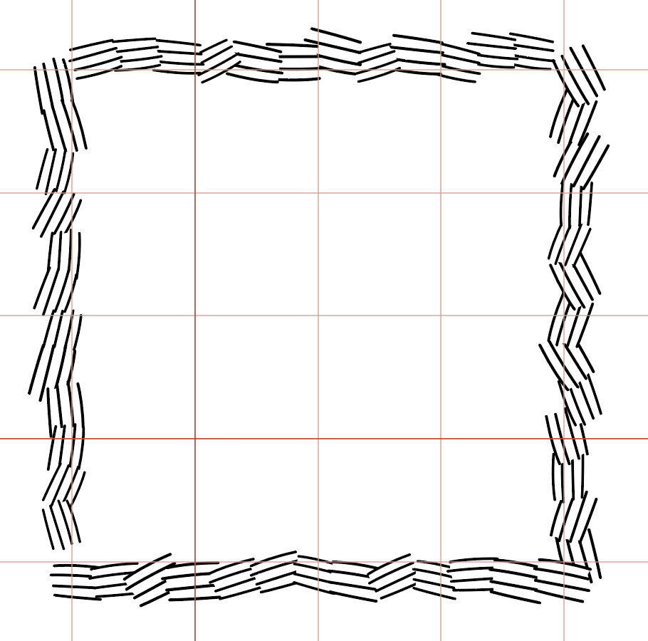
(1) Draw lines (2) make lines irregular (3) draw white masking shape behind lines
Draw four parallel(ish) black lines.
Make them slightly irregular, with a bit of a curve. Use the Curvature tool (Shift-’) to add a bend. My lines are 0.3 points thick with rounded end caps to mimic a 0.1 mm pen. Remember: we want these to look hand-drawn.
Draw a white masking shape and move it behind the lines with Send to Back (Object > Arrange > Send to Back). A characteristic of this hatch style is that the lines do not cross each other — they butt into other lines. We’ll recreate this look by drawing white shape that obscures any lines behind our hatch.
Select the four lines and the white fill and drag to the Brushes panel to create a new Scatter brush. Name it “Hatch 01” and give it the following settings:
Hatch 01 Settings
Hatch 01 Brush
Size: Random, 100% — 130%
We can introduce a bit of variation in the size of these hatches by letting them scale up a little.
Spacing: Random, 75% — 90%
Our hatch stamps should just overlap to prevent blank spaces on our line.
Scatter: Random, 10% — 40%
Our stamps will move in and out a little to mimic the variation of hand-drawn lines.
Rotation: Random, 70° — 110°
We want these lines to run roughly parallel to our path. 90° of rotation would accomplish this. We’ll let these rotate between 70° and 110° so they’re nicely irregular.
Rotation relative to: Path
The lines should orient themselves along the path.
Hatch 02 Brush
We now need to put another brush on top of this one, to create the oblique angle intersections that characterize this hatch style. We could just use the same brush again with different settings, but if we create a new brush we can introduce a little more variation and make it look more like a freehand drawing. So, repeat the process of making the hatch brush with four lines and a white fill and drag those to the Brushes panel. Name this Scatter brush “Hatch 02” and give it these settings:
Hatch 02 Settings
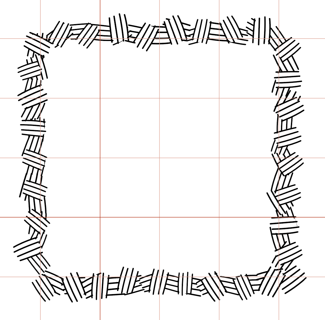
Hatch 02 over Hatch 01
Size: Random, 100% — 130%
Same as Hatch 01.
Spacing: Random, 100% — 120%
The spacing on this brush will be wider, allowing our first brush to show through.
Scatter: Random, 20% — 40%
Again, our stamps will move in and out a little to mimic the variation of hand-drawn lines.
Rotation: Random, -40° — 40°
We want this brush to run very roughly perpendicular to our path. A rotation of 0° would make this happen, so we’ll let these rotate between -40° and 40° so they’re nicely irregular.
Rotation relative to: Path
The lines should change orientation with the path.
In the Appearance panel, add a new stroke to the path and apply the Hatch 02 brush to it.
Again in the Appearance panel, add a white fill and a black stroke as you did with the stipple brush. Your final style should look like this:

Bottom to top: Hatch 01, Hatch 02, White Fill, Black Stroke with a wavy profile
Drag this path to the Graphic Styles panel and name it something like “Hatch Walls.” Now you can quickly apply this look to any path.
That’s it! You’ve created two styles for quickly drawing dungeon maps. Don’t forget to save your file.
Reversed Paths

(left) A path with a complex appearance applied (right) that same path with its direction reversed
Every path in Illustrator has a start point and an end point — even closed paths. As paths are created and edited, it is possible for their direction to become reversed. This is often not an issue with simple stroke styles, but with complex appearances like our stipple and hatch brushes it can cause paths to display in a way we don’t intend.
Fortunately, it is a simple problem to fix. If the stroke appears to be reversed across the stroke, select Object > Path > Reverse Path Direction. The interior portion of the stroke will flip to the exterior, and all will be well.
Don’t forget to follow @cryptocarto for more content and tutorials.